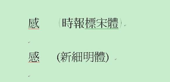
I’ve noticed certain interesting irregularities in Chinese fonts. The book I’m reading at the minute (《馬橋詞典》; the edition was originally published by 聯經出版社/Linking Books) in Feb. 2011, and this copy is the second printing) uses the form of the character 感 seen in the top line of the image below, as opposed to the one on the bottom. The character on the top line has a 丿that encloses the entire character, as opposed to the one on the bottom line in which the heart radical at the bottom is separate.
 I’ve noticed similar differences in other characters before and was curious if anyone else had spotted any other slight differences that come to mind. Also curious if this is influenced by historic instances of difference in the way the character can be written.
The interesting thing for me as a Cangjie user is that it should technically change the way the character is written in Cangjie, as instead of 戈口心 it should follow the example of 威 (戈丿一女) and be written 戈丿一心, although obviously this is just a font.
Which form do you come across the most in the books you are reading? What are the names of the different fonts that use this form?
