Out and About with Variants in Taiwan

I’m always interested to see how variants of standard Chinese characters are still used in everyday life, whether it’s handwriting, signs or an author making a stylistic choice.

I spotted this beauty at a petrol station in Taitung. You can understand the reason for the simplification of the top of the character given the chunky font required by this kind of paint:
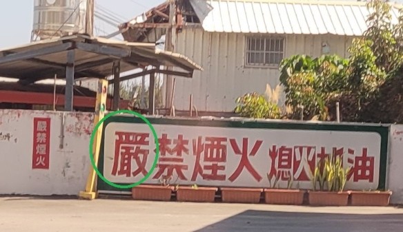
This character is 「嚴」(yán/strictly), but the top has been simplified along the same lines as the simplified version of the character 「严」. It retains the 「敢」 of the traditional character though:
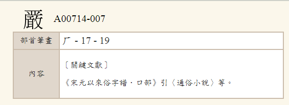
You can look up these kinds of variants in the variant dictionary here.

Funnily enough there is a standard 「嚴」 on the sign to the left of the one circled.

Have you ever caught a p̶o̶k̶e̶m̶o̶n̶ Chinese character variant in the wild? Submissions welcome!

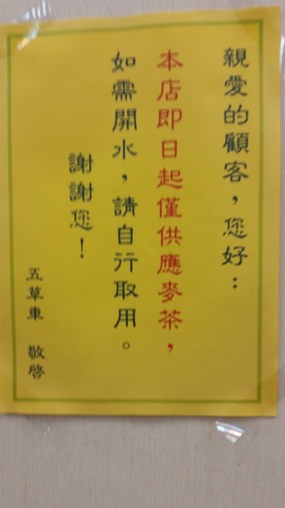
Like the font of this 「行」; 你會喜歡我這一「行」嗎?

20160226_123945.jpg

I’ve seen this form of the character 「行」quite a lot, but not sure which fonts give you it. Sorry for the blurry photograph, I was taking it while people were staring at me wondering why I was taking a photo of such an uninteresting sign.

If you’ve seen any weird or pretty fonts out and about, let me know! Enjoy the long weekend!

Font Matters 字體異型

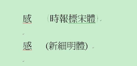
I’ve noticed certain interesting irregularities in Chinese fonts. The book I’m reading at the minute (《馬橋詞典》; the edition was originally published by 聯經出版社/Linking Books) in Feb. 2011, and this copy is the second printing) uses the form of the character 感 seen in the top line of the image below, as opposed to the one on the bottom. The character on the top line has a 丿that encloses the entire character, as opposed to the one on the bottom line in which the heart radical at the bottom is separate.
ganI’ve noticed similar differences in other characters before and was curious if anyone else had spotted any other slight differences that come to mind. Also curious if this is influenced by historic instances of difference in the way the character can be written.

The interesting thing for me as a Cangjie user is that it should technically change the way the character is written in Cangjie, as instead of 戈口心 it should follow the example of 威 (戈丿一女) and be written 戈丿一心, although obviously this is just a font.

Which form do you come across the most in the books you are reading? What are the names of the different fonts that use this form?